"(《世界人权宣言》) Image Gallery widget allows you to easily add and style complex and beautiful image galleries on your page.
内容
Settings
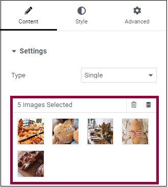
- Type: Select type of gallery, choosing from Single 或 Multiple. Multiple allows you to have a filterable portfolio-style gallery of images
- If Multiple is chosen, enter a title into the field or use Dynamic Tags *
- Add Images: Choose multiple images from the media library to insert into your gallery and type a 标题 for the gallery
- You may also use the Dynamic Tags option to load images from the Post image attachments, Advanced Custom Field gallery, or WooCommerce product gallery. This is helpful when creating a Single Post or Product template in the Theme builder
- Order By: Choose Default or Random order
- Lazy-Load: Set to Yes to use Lazy Load to improve loading speed.
- 布局: Select from Grid, Justified, or 砌筑.The Grid is based on an aspect ratio of your choosing. Justified lets you set the height for each row, and adjusts to different widths per image. 砌筑 maintains the same image width and adjust to varying heights.
- 专栏: Set how many columns will be displayed per row, from 1 to 24. Not available if Justified Layout is chosen.
- Row Height: Set the height of each row, in pixels. Only available if Justified Layout is chosen.
- 间距: Control the amount of space between each image in a row.
- 链接: Set the link for the images to None, Media File, or Custom URL
- Aspect Ratio: Choose the Aspect Ratio, selecting from 1:1, 3:2, 4:3, 9:16, 16:9, and 21:9. Only available for Grid layout.
- 图像分辨率: Set the size of the image, from thumbnail to full, or enter a custom size.
If Type: Multiple is chosen, the following Filter Bar additional options become available:
Filter Bar (only available if Multiple type is chosen)
- “All” Filter: Select Yes to include the “All” filter, or No to exclude it.
- “All” Filter Label: If set to Yes, enter the desired label or use Dynamic Tags. “All” is default.
- Pointer: Select the pointer used when hovering over each filter label. Choose from None, Underline, Overline, Double Line, Framed, Background, or Text.
- Animation: Set the Pointer’s animation style. Choose from Fade, Slide, Grow, Drop In, Drop Out, or None.
Overlay
- Background: Select Yes to have an overlay appear upon hovering over each image, or No for no overlay.
- 标题: Choose which meta attribute to display as the overlay’s Title. Select from the image’s Title, Caption, Alt, Description, or None.
- Description: Choose which meta attribute to display as the overlay’s Description. Select from the image’s Title, Caption, Alt, Description, or None.

风格
图片
- 边框颜色: Choose the color of the image border, for Normal and Hover states
- 边框宽度: Choose the thickness of the border for Normal state only.
- 边界半径: Control the corner roundness of the image border, for Normal and Hover states.
- CSS 过滤器: Set CSS Filters, selecting from Blur, Brightness, Contrast and Saturation for Normal and Hover states.
- Hover Animation: Choose the animation of the image upon hover, selecting from None, Zoom In, Zoom Out, Move Left, Move Right, Move Up, or Move Down, for Normal and Hover states.
- Animation Duration (ms): Set the amount of time the animation takes, in milliseconds.
Overlay
- Overlay: Select the type of Overlay (Classic or Gradient) for the images’ Normal and Hover states.
- 颜色: Set the Overlay color or gradient colors for the images’ Normal and Hover states.
- 混合模式: Select from multiple layer effects including Normal, Multiply, Screen, Overlay, etc. View Blend Mode demo
- Hover Animation: Choose the overlay’s Entrance or Exit animation upon hover. Select from Slide In Right, Slide In Left, Slide In Up, Slide In Down, Zoom In, Zoom Out, and Fade In. If Entrance Animation is chosen, images are shown full opacity in Normal state, with the overlay covering the image upon hover. If Exit Animation is chosen, the overlay covers the image in the Normal state, and is removed upon hover.
- Animation Duration (ms): Set the amount of time the animation takes, in milliseconds.
内容
- 对齐: Align the content to the left, right, or center
- Vertical Position: Align the content to the top, middle, or bottom
- Padding: Adjust the content’s padding
标题
- 颜色: Choose the Title’s color
- 排版:设置标题的排版选项
- 间距: Set the amount of space between the Title and the Description
Description
- 颜色: Choose the Description’s color
- 排版: Set the typography options for the Description
- Hover Animation: Choose the content’s Entrance, Reaction, or Exit Animation upon hover. For Entrance Animation, select from Slide In Right, Slide In Left, Slide In Up, Slide In Down, Zoom In, Zoom Out, and Fade In. For Reaction Animation, select from Grow, Shrink, Move Left, Move Right, Move Up, or Move Down. For Exit Animation, select from Slide Out Right, Slide Out Left, Slide Out Up, Slide Out Down, Zoom In, Zoom Out, and Fade Out.
- Animation Duration: Set the amount of time the animation takes, in milliseconds.
- Sequenced Animation: Set to Yes to have Title and Description animate in sequence. Set to No to have Title and Description animate at the same time.
Filter Bar
These Filter Bar additional options become available only if Type: Multiple was chosen.
- 文字颜色: Choose the color of the Filter bar text for Normal, Hover, and Active states.
- 排版: Set the typography options for the Filter bar text.
- Pointer Color: Choose the color of the Filter bar pointer. Only available in Hover or Active states.
- Pointer Width: Select the thickness of the pointer.
- 空间之间: Control the amount of space between Filter text items.
- Gap: Control the amount of space between the Filter text and the gallery images.
高级
Set the Advanced options that are applicable to this widget
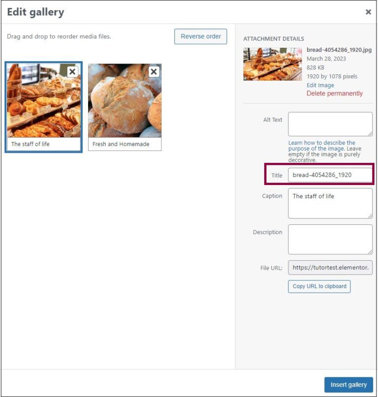
Captions and titles in a gallery
The Gallery widget allows you to display an image’s caption or title as part of the overlay. However, these captions/titles may not be suitable for the Gallery widget, so users have the ability to edit the captions/titles of the images displayed in the widget.
Editing the captions/titles
To edit the caption and/title:
- To change the caption – Click the caption area and type in a new caption in the text area.
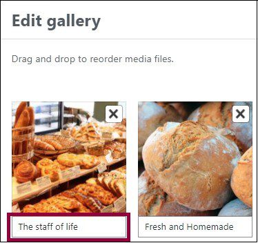
- To change the title – Click the image and enter a new title in the text box.
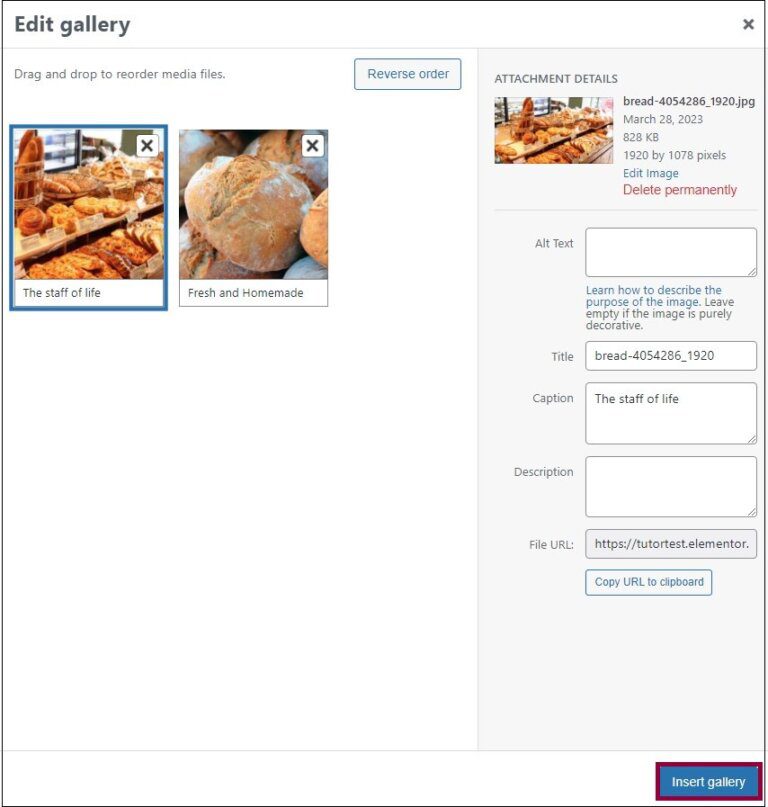
- 点击 Insert gallery.

 English
  Français
  Italiano
  Español
  Deutsch
  Русский
  한국어
한국어  Português do Brasil
  Türkçe
  العربية
  日本語
日本語  简体中文
简体中文  Suomi
Suomi  Slovenščina
  Magyar
  Polski
  Bahasa Indonesia
  Dansk
Dansk  Čeština
  Eesti
Eesti  Norsk bokmål
0条评论